# Print the first 6 rows
head(employee_salaries)
Salary
1 65700
2 60060
3 67320
4 34680
5 82080
6 68700When people start learning statistics, the term distribution is one of the first non-trivial concepts they encounter. It often appears alongside words such as probability, statistical, or empirical, each with its own nuance. At its core, however, a distribution simply describes how data or probabilities are spread (distributed), making it a fundamental concept in statistics.
In this chapter, we discuss statistical distributions, as every distribution is essentially ‘statistical’. Our main goal is to build an intuitive understanding of these concepts without immediately worrying about mathematical formulas or technical jargon. Grasping distributions is the key to understanding many other statistical concepts, such as hypothesis testing.
In very simple words, a statistical distribution is a function that describes how values of a variable are spread. Even though this description is simple and clear, perhaps it is still difficult to understand, so let’s present an example.
Suppose we have a single column in a data frame (or table), called
employee_salaries, that describes the yearly salary of
employees, drawn as a random sample of some stated population. Let’s
use the head() function to see and review the first six
rows of the data frame:
# Print the first 6 rows
head(employee_salaries) Salary
1 65700
2 60060
3 67320
4 34680
5 82080
6 68700
Our data frame (employees_salaries) includes only one
column (Salary), as was expected. On these first six
rows, we see that there is one person who earns more than $80,000
per year and another one who earns less than $40,000 per year, while
the yearly salary of the rest of the employees is between $60,000
and $70,000. The question is then, how can we show all these
salaries in a single graph so as to better understand the salary
range? After all, based on the whole data set, is $60,000 per year a
high salary when compared to that of the rest of the employees in
our sample?
We refer to the column Salary as a
variable because it… varies: there are many different
values that it can take. In other words, each employee can have a
different salary, meaning that salaries vary between employees and,
hence, they are not constant (i.e., the same value for every member
of the sample).
Although we could browse the data frame or make calculations to understand the most common or expected yearly salaries (e.g., calculate the mode or the average salary of the entire column), it would be much more informative to have a plot to help us understand how the values are actually spread (i.e., distributed). We can visualize any distribution with a density plot, or a histogram. Even though these are two different types of plots, the intuition is the same.
Let’s see what a density plot is and how it can help us visualize the distribution of employees’ salaries:
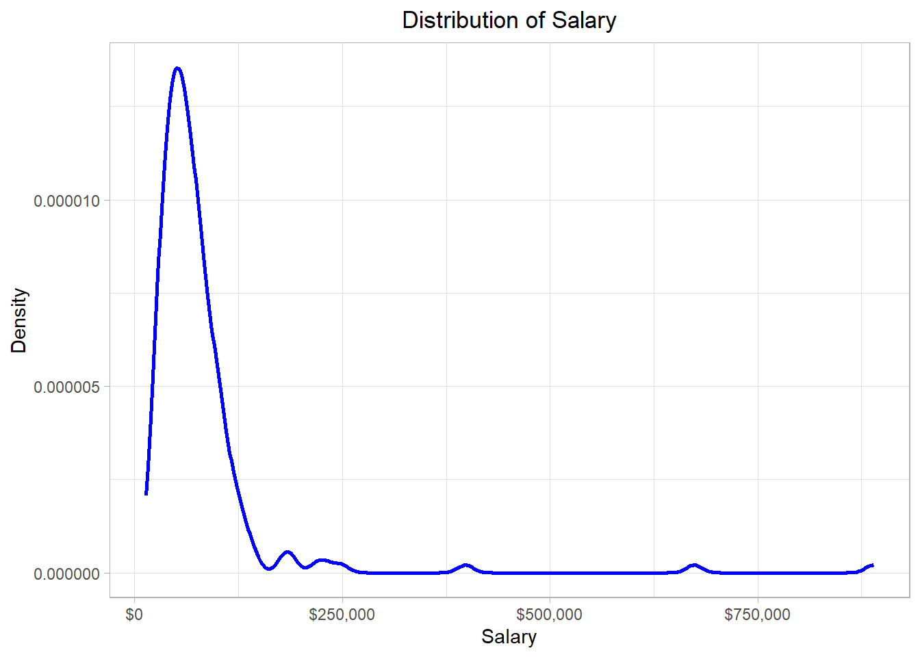
In this graph, the x-axis (horizontal) represents the salary while the y-axis (vertical) represents the “density”. Before we define what density is, let’s - for now - try to focus on the blue line of this graph. We see that the blue line has a “strange” shape. Actually, we can think of this line as the height of a mountain at different points along the salary scale, which in our statistical context is the distribution. To make sense of that idea, we can imagine that the hill is this whole grey piece in the plot below:

Observing closely, we see that the surface of the mountain range (which is represented by a blue line also in this plot) has exactly the same shape as the blue line in the previous plot. This mountain range is our distribution, the function that describes how the employees’ yearly salaries are spread. Why do we describe a distribution as a mountain range? Well, the higher a mountain is, the more land it covers. Following the same logic, we conclude that the higher a part of a distribution is, the more values are in there.
In our example, the line has a peak at the point where the value of the x-axis is around $55,000 (where the black dashed line is) while it is mostly flat where the values of the x-axis are very high. Thus, the majority of the salaries are of an amount close to $55,000 while there are a few points (salaries) higher than $250,000.
Regarding density values, the ones on the y-axis, those are usually associated with probability values. Density, which is also called probability density, is calculated using different methods, depending on the context. In a density plot, the density is usually calculated by a method called Kernel Density Estimation. Right now, it is not so important to understand this particular method, so we will not delve into further details. By using a statistical software or a programming language such as R, we can create density plots quickly and easily. The most important thing to remember in a density plot is that the height of the curve at a particular point reflects how likely it is that observations are found in a particular (x-axis) region.
One common mistake with density plots is to think that the height of the density curve is the probability of observing a value at that exact point. This is not correct. In continuous data, the probability of hitting exactly one value—say exactly x=5—is zero, because there are infinitely many possible values. Instead, what the density tells us is how values are concentrated around a point.
For example, if the density at x=5 is high, it does not mean the probability of getting exactly 5 is high (that probability is zero). It means that values near 5 are relatively common. Probabilities only come in when we look at an interval on the x-axis—for instance, the probability of a value falling between 4.5 and 5.5. That probability is equal to the area under the curve in that range.
This also explains why density values can be greater than 1: they are not probabilities themselves. Probabilities must add up to 1, but densities only indicate how “tall” or “concentrated” the distribution is in different regions.
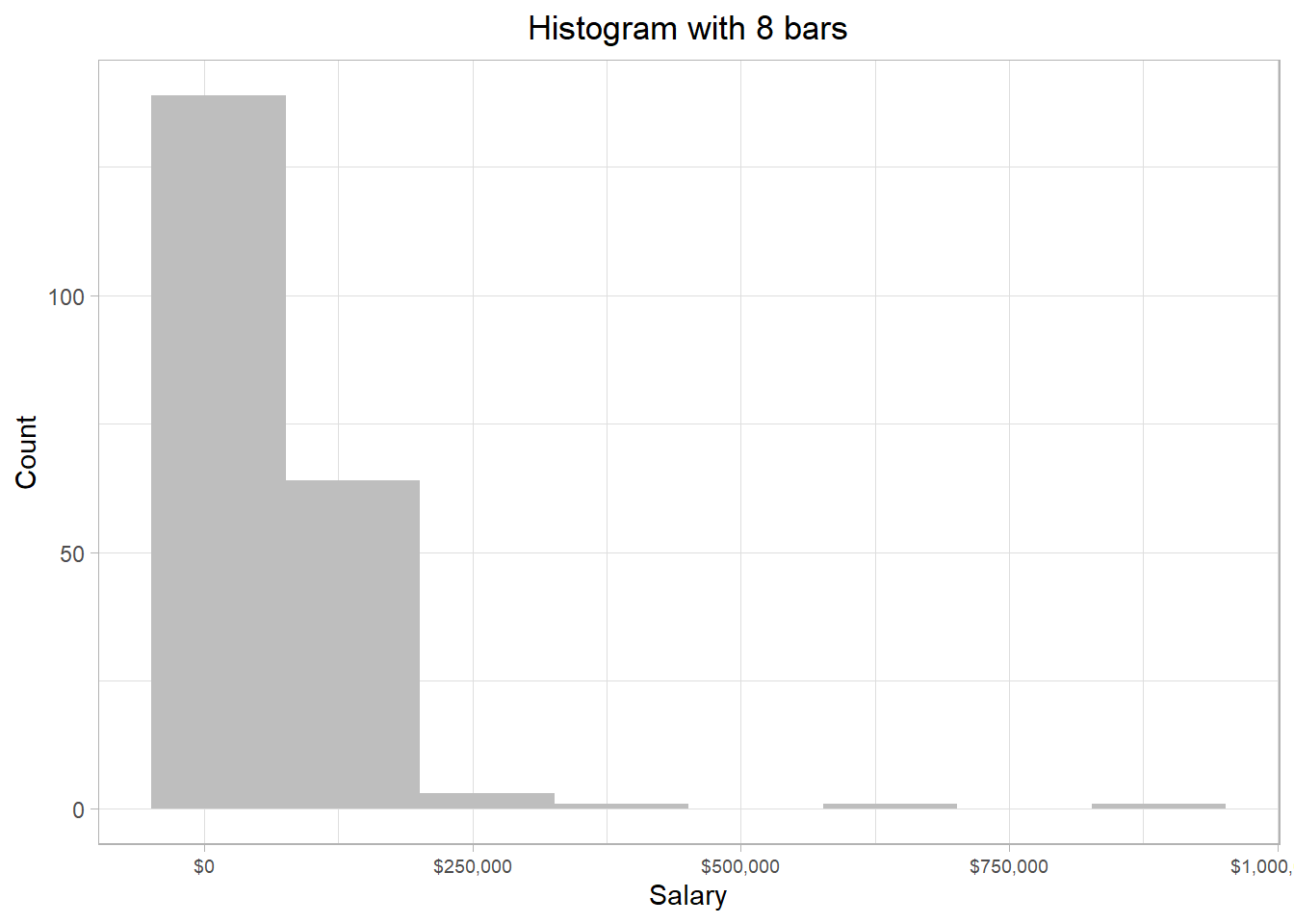
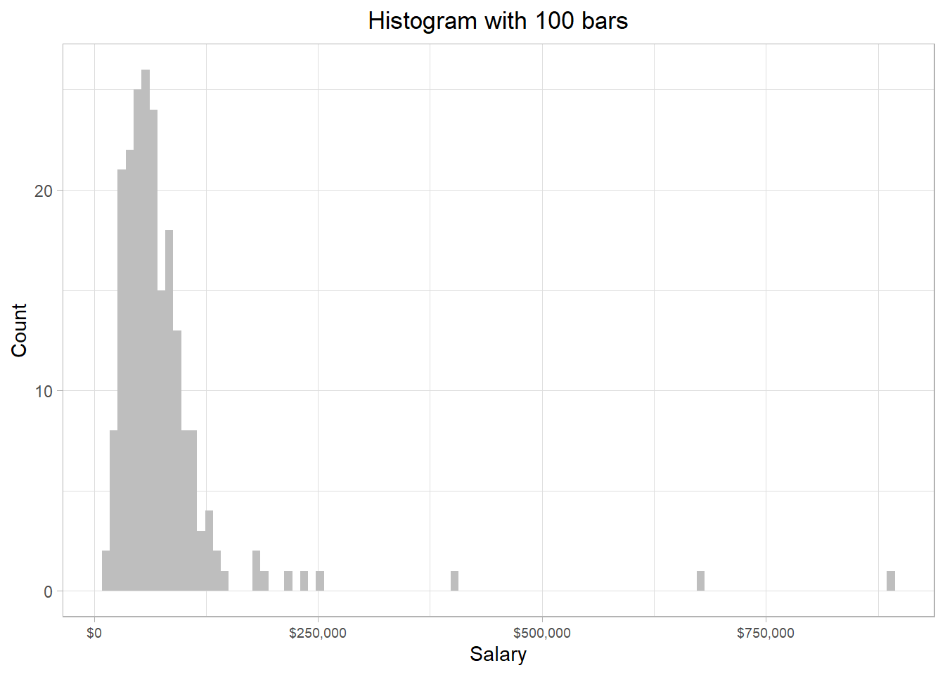
Besides a density plot, we can also use a histogram to visualize the distribution of the salaries. The resulting plot for our dataset would be the one below:
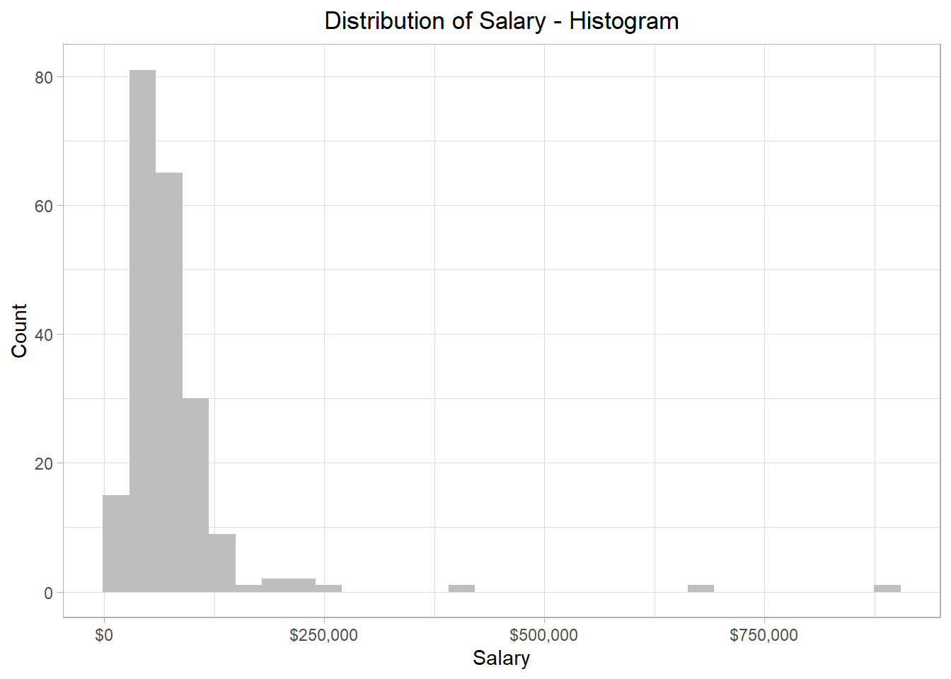
We see that the overall pattern is the same, but instead of a smooth curve that describes the shape of the distribution, the distribution is now split within different bars, which essentially involve different values of the distribution. In addition, with histograms, the y-axis shows how many values (salaries) belong to a bar. For instance, the highest bar corresponds to a value of 84 in the y-axis, meaning that 84 employees’ salaries are included in that bar. This bar lands on the x-axis at the value of approximately $60,000, meaning that this bar contains the salaries that are approximately $60,000. How many salaries are considered close to $60,000 depends on the width of the bars.
We can make these bars larger or thinner, to capture the distribution in a more granular way. To grasp this intuition as well as the different outcomes, we can look that the following plots that show the distribution of salaries when the bars are very large (left plot) and very thin (right plot):
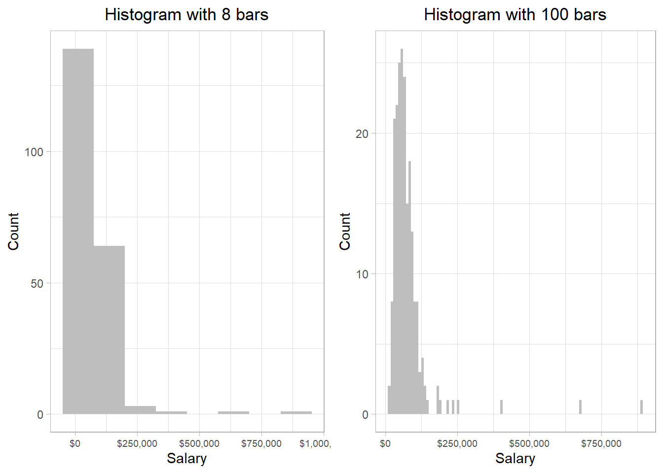
The y-axes have different values in the two plots. This makes sense because the thinner a bar, the fewer salaries it is able to capture. However, the general pattern is the same: most of the salaries are below $130,000, while there are just a few that exceed that amount.
We could create a histogram with only one, very large bar, that would capture all the salaries in our data frame: the corresponding value in the y-axis would of course be the total number of the salaries found in our data set. On the other hand, creating a histogram with as many bars are possible, we would essentially be creating a density plot. In other words, a density plot is essentially a histogram with very thin bars: essentially, vertical lines.
Note that in all these cases, it does NOT matter if two or more employees receive the exact same salary. These salaries are still counted separately to define the height of a bar. Actually, in our data set, there are a few employees who get exactly the same salary.
However, the column salary is still considered a variable
because not all employees get exactly the same salary. If that
was the case, then indeed the column Salary would
be considered a constant.
The width of the bars then will then depend on how well they help us understand the distribution. In other words, there is no right or wrong answer in the question “how many bars” or “how wide the bars should be in a histogram”?. Remember, we want to use histograms and density plots to get a visual idea of how the salaries are spread. As long as we see the general shape, we don’t need to worry too much about such details.
With software like R or Python, we can adjust the number or width of the bars in a histogram. While extreme changes in these settings may alter the appearance, the overall shape of the data distribution generally remains the same. The key is to choose settings that make the distribution easier to interpret in the graph.
It is not an accident that the general shape of the density plot and the histograms that we created was very similar to each other; we used the same data and, as a result, the distribution should be the same. As mentioned, a density plot is essentially a smoothed version of a histogram, where the area under the entire curve (the area of the mountain) sums to 1, assuming it is normalized. Whether we should use a density plot or a histogram to visualize the distribution of a variable is thus mostly a matter of preference.
Before we discuss how we can use distributions, it is necessary to
emphasize that there are two types of distributions:
discrete and continuous. So far,
we have focused on continuous distributions, which are distributions
that include variables that can take an infinite number of values.
In the salary example, an employee could have a salary of $62,000 or
$62,002: those two are different salaries (salaries could
theoretically differ also at the n-th decimal, thus we treat them as
continuous variables). Discrete distributions, on the other hand,
involve variables that take only integer values. For example, the
mtcars dataset, which is a built-in data set in R, has
a column called carb. This column reflects the number
of carburetors, which are devices controlling the mix of air and
fuel for a combustion engine to work, and therefore we refer to
their number as a discrete variable; a car cannot have 1.5
carburetors. The following plot illustrates the distribution of the
carb variable:
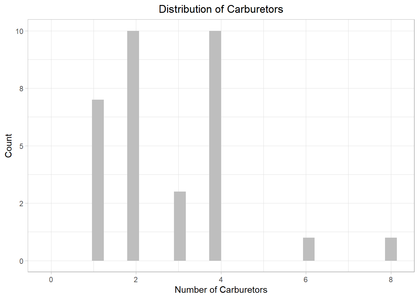
The plot illustrates that most cars in the sample have either 2 or 4 carburetors, with two cars only having more than 4. While we could use a density plot, this is mainly useful for continuous distributions, not discrete ones. To emphasize the point, let’s look what happens if we had chosen a density plot:
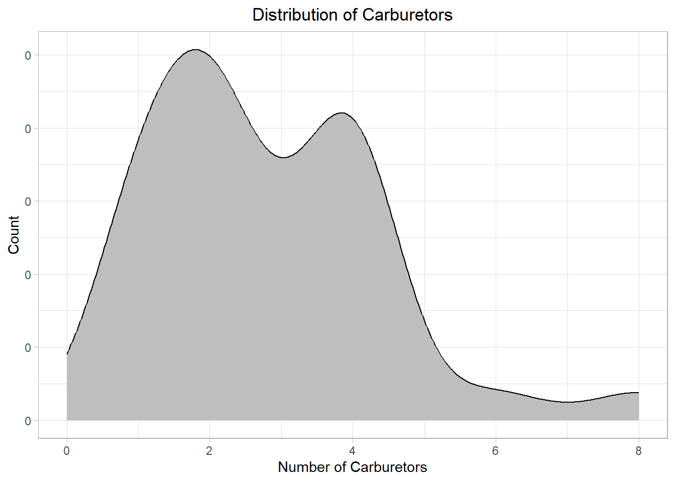
Even though the general pattern is visible, the plot looks off! We could however adjust the plot (the kernel density estimation that we mentioned earlier) to make it better fit our data:
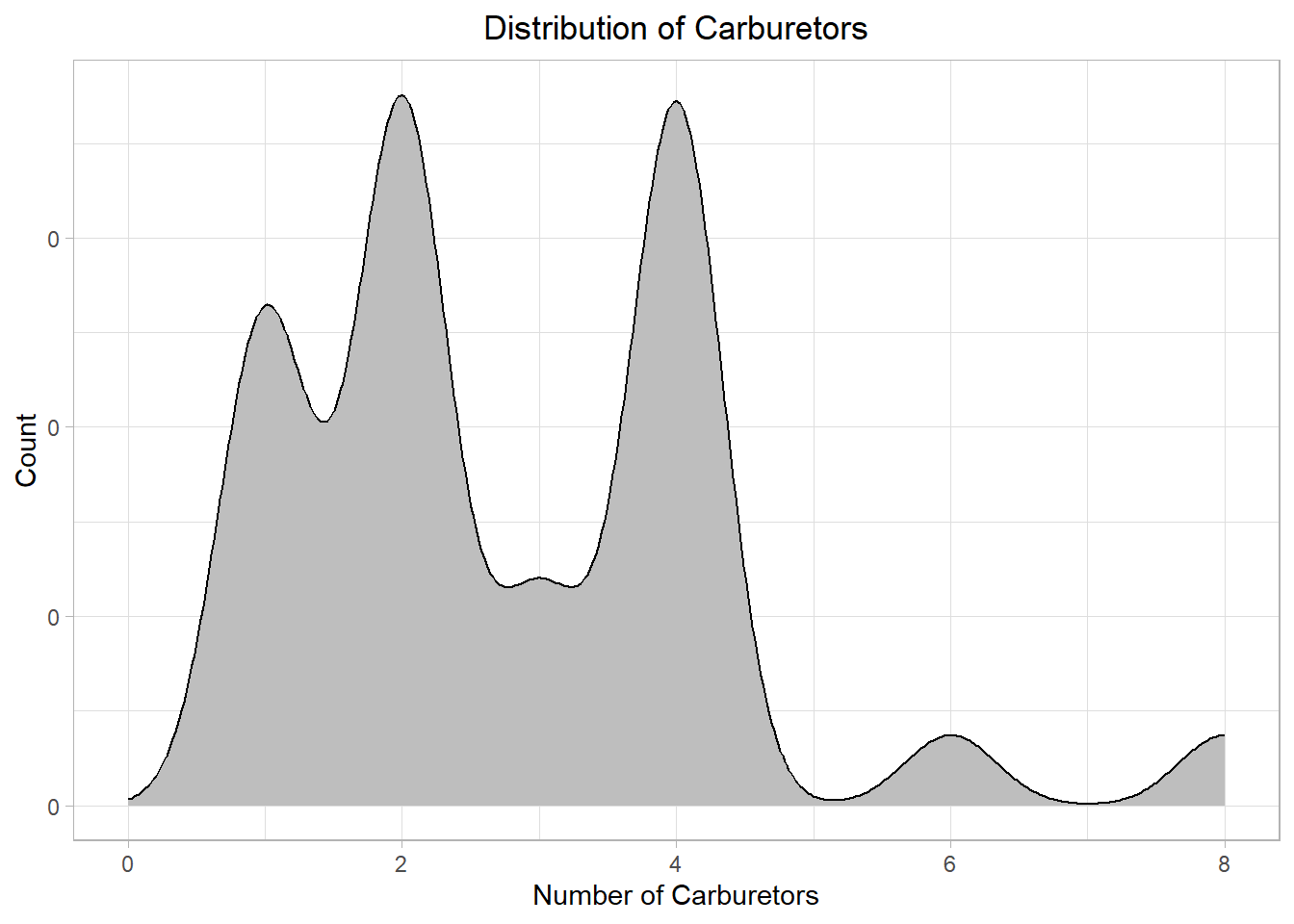
The plot is more clear now. Still, in most cases, a histogram is better for discrete distributions than a density plot because it clearly shows the count or frequency of each value. For continuous distributions, we can use a histogram for raw frequency insight, and a density plot for smoother shape estimation.
Actually, a histogram presents a continuous distribution as discrete. This happens because many different values are binned together in each bar of the histogram. To illustrate this point, we can revisit the earlier histogram with 8 bars:
The first and tallest bar represents salaries approximately from -$70,000 to $70,000 — even though negative salaries aren’t realistic — the second bar reflects salaries approximately from $70,000 to $210,000 and so on. Thus, the heights of the bars represent the frequency of the values of the x-axis captured within the bars.
We usually don’t need to worry about values falling exactly on the edge between bars. But if it happens, the value typically goes into the bar on the right-hand side.
We can do many things when presented with a distribution, such as identify the most common or most rare values. Additionally, we can use a distribution to calculate the probability that a particular value appears. Probability is the frequency of appearance (typically refered simply as “frequency”) of a particular value over a set of values. If we have a bag with 5 red marbles and 5 blue marbles and we are asked to draw one marble at random, the probability that we will draw a red marble is 50%, because 5 divided by 10 is 0.5 (or 50%).
When statisticians use a distribution to calculate probabilities, they call it a probability distribution. Even though it sounds like something new, it’s still just a distribution.
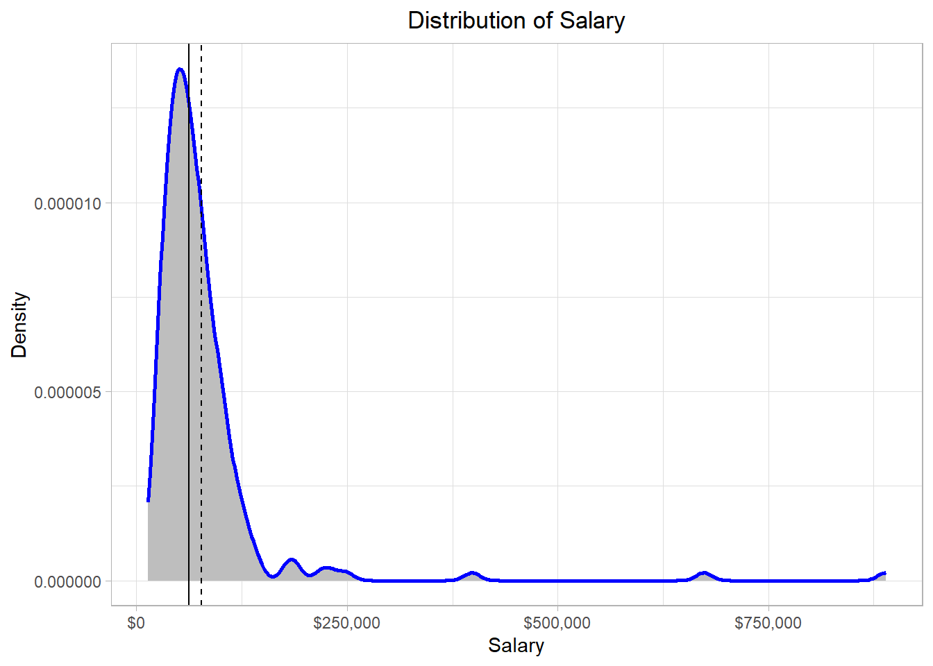
To understand how the concept of probability is connected to a statistical distribution, let’s investigate the very small hills of our salary distribution at the points where the values of the x-axis are approximately $400,000, $650,000 and $875,000. For this, we use one of the previous histograms:
On the right hand side, there are three bars relatively far away from the other bars. These bars represent some employees that have very high salaries compared to the rest of the employees in our sample. All these salaries are higher than $300,000, so we can use this value to filter out the data frame.
Due to the vectorization property in R, we can actually filter out the salaries that are below $300,000 by using a logical condition directly on the vector. The expression employee_salaries[employee_salaries > 300000] returns only the values in the employee_salaries vector that are greater than 300,000, effectively filtering out the rest:
# Salaries higher than $300,000
employee_salaries[employee_salaries > 300000]
[1] 398400 673980 889320Suppose now we have the following question: “What is the probability that we (randomly) select a person from the data that earns more than $300,000?”? To answer this question, we follow the following easy steps:
Count the number of employees that earn more than $300,000
Count the total number of employees
Divide the first number by the second number
From our code, we saw that we have 3 particular salaries over $300,000. Also, the number of employees is essentially the number of rows in the data frame, which is 209. Dividing 3 by 209, we would get approximately a value of 0.014, or 1.4%. Thus, the probability that we select a person from the data that earns more than $300,000 is 1.4%. This percentage reflects that it is very rare (but not impossible) to select an individual who earns more that $300,000.
We can actually perform this entire calculation in a single line of R code:
# Salaries higher than $300,000
sum(employee_salaries > 300000) / nrow(employee_salaries)
[1] 0.01435407In this line of code, R first counts how many salaries exceed $300,000 by adding the TRUE values—since in R, TRUE is treated as 1 and FALSE as 0—then divides that count by the total number of employees. This gives us the proportion—or estimated probability—of randomly selecting someone earning more than $300,000.
Extreme values of a distribution are usually called outliers because they can be seen as values that are very different from those of the majority. There are different strategies about how to handle these values, depending on the type of analysis, the reasons why they may appear, etc.. For now, it is sufficient to just be aware of them.
How does this concept connect to the distribution though? Well, if we think that the whole area of the distribution is 1 (summing up the area of all the bars), *the area that the salaries higher than $300,000 captures is 0.014 (or 1.4%).
A related concept is that of quantiles. If we imagine a distribution as a whole pie, we can “slice” it into equal parts called quantiles. For example, quartiles divide the data into four equal parts. The first quartile (Q1) marks the point below which 25% of the data fall, the second quartile (Q2) is the median (50%), and the third quartile (Q3) marks the point below which 75% of the data fall.
We can go even further by dividing the data into 100 equal parts, which gives us percentiles. For instance, the 90th percentile is the value below which 90% of the salaries lie. If a salary is at the 90th percentile, it means it’s higher than 90% of the other salaries in the data.
These concepts help us understand where a specific salary lies within the overall distribution. So when we say only 1.4% of employees earn more than $300,000, we’re essentially talking about the upper tail of the distribution—those beyond roughly the 98.6th percentile. Quantiles, quartiles, and percentiles give us the tools to describe and interpret these positions more precisely within the dataset.
The idea of associating proportions with areas under the curve works especially well when visualizing data with a histogram, where each bar directly represents the number of actual observations within a range of values. However, if we use a density plot instead of a histogram, things change slightly. A density plot smooths out the distribution to show the general shape or trend of the data, and the y-axis no longer shows counts but density values. While the area under the curve still sums to 1, it no longer reflects actual counts, which makes it less precise for identifying the number of individuals in extreme ranges or with specific values—especially when working with discrete data like individual salary amounts.
A density plot would work however when our distribution resembles a theoretical distribution, a concept we will revert to shortly. As an example, suppose we have a dataset with heights of 1,000,000 people. Let us this time combine a histogram and a density plot in one to visualize this dataset:
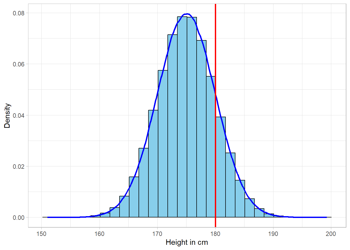
The density line does an amazing job of describing the data. As previously, we can make probability calculations, such as estimating the probability that a person is higher than 180cm. This can be translated as the probability that a person belongs to the right side of the red line. If the area of the whole distribution sums up to 1, the area on the right side of the red line is actually the estimated probability.
The bottom line is that probabilities are just pieces of the area under the distribution. Although we could simply count the rows in our dataset to calculate probabilities directly, introducing the concept of probability and connecting it to that of a statistical distribution is essential for future applications. This is because we often need to calculate probabilities based on theoretical distributions — we just saw one example — not just observed data. In such cases, we won’t have a dataset to count; instead, we’ll assume a distribution of a specific shape and measure a specific area that we’re interested at. Statisticians calculate areas under theoretical distributions to conduct hypothesis testing, which involves comparing a calculated area to a predefined threshold.
In the last example, we looked at a very large sample of people’s heights, which formed a smooth, symmetric curve. That shape wasn’t random—it closely resembled a well-known theoretical distribution called the normal distribution, often referred to as the bell curve.
Unlike distributions formed from actual data, theoretical distributions are mathematical models. They describe how the values of a variable are expected to behave based on certain assumptions. In other words, we can use a theoretical distribution to understand how a variable tends to vary — even without having any data — just by knowing a few of its key characteristics. This is incredibly useful because it allows us to estimate probabilities, make predictions, and describe the behavior of a variable through formulas alone.
So, in statistics, we typically work with two types of distributions:
Sample or population distributions, which are based on observed data.
Theoretical distributions, which are defined by mathematical functions and parameters.
Even though the equations behind theoretical distributions can look intimidating, there’s no need to memorize them. What matters is understanding what each parameter represents. For example, the normal distribution is fully described by just two parameters: the mean and the standard deviation (which we discuss shortly in more detail). These two numbers shape the entire curve, and no matter the values, the normal distribution will always follow the same bell-shaped form.
One of the key strengths of theoretical distributions is that we can use them to answer practical questions. For instance, if we know that people’s heights follow a normal distribution with a given mean and standard deviation, we can calculate the probability of someone being taller than 180 cm without having to collect millions of height values. This is incredibly powerful, as it means we can generalize from a sample to a population and perform various types of statistical inference — all grounded in the idea of a theoretical distribution.
Of course, the normal distribution is just one example. There are many different theoretical distributions—some are continuous, like the log-normal, and others are discrete, like the binomial. Each one applies to different types of data (underlying variables) and situations. For example, salaries tend to follow a log-normal distribution (right-skewed and only positive), while binary outcomes like “yes” or “no” typically follow a binomial distribution.
The important thing is to know when a certain theoretical distribution is appropriate and to use the correct parameters for it. Using the wrong distribution — for example, applying a log-normal model to normally distributed data — can lead to invalid conclusions about things like variability and probability.
Once a theoretical distribution is defined, we can use it to calculate key measures like the mean and standard deviation, and we can also compute probabilities for different outcomes. Even more, we can simulate data from a theoretical distribution. This means we can “draw” fake values that follow its shape, which can be extremely helpful for visualization, testing statistical methods, or building intuition about how data behaves.
The suggested framework to learn about any theoretical distribution is the following:
When do we encounter this distribution?
What are the parameters of the distribution?
What does the distribution look like?
How do we calculate key measures?
Can we simulate values from it?
We’ll use this framework in the upcoming chapters to introduce and explore the most commonly used theoretical distributions in statistics.
Beyond the area of a distribution, it is very useful to calculate specific measures such as the average value. These measures provide information about the different characteristics of a distribution. Generally, there are three types of measures: central tendency measures, which reflect where the majority of the values exists, and variability measures, which show how spread values are in general.
The mean, or average, is the most common measure of central tendency. It is probably the most common measure to describe the values of a distribution. The mathematical formula is the following:
\[ \mu = \frac{x_1 + x_2 + ... + x_N}{N} = \frac{\sum_{x = _1}^{N} x_i}{N} \]
In the formula above, the letter \(x\) represents the different values of the variable of interest. For instance, \(x_1\) represents the first value, \(X_2\) represents the second value and so on. The letter \(N\) is the number of values (or observations) in our data. On the left side of the equation, we see that we have \(\mu\) , which is the common symbol used to represent the average (mean) value of a variable.
Calculating the mean is straight forward. If we have three different salaries of $52,000, $60,000 and $65,000, the average salary would be:
\[ \frac{52000 + 60000 + 65000}{3} = \frac{177000}{3} = 59000 \]
Another central tendency measure is the median, which is the middle score (50th percentile) of a distribution. In our previous example, the median value would be $60,000, since this value is the middle one in our distribution.
Suppose however that we had a fourth salary of $59,000, meaning that there is no single value exactly in the middle. In these cases, the median would be the average of the middle values:
\[ \frac{60000 + 59000}{2} = \frac{119000}{2} = 59500 \]
Lastly, the mode is simply the value that appears the most in a distribution. This is the case when that we have more than one value that is repeated the most in a distribution. In case we have two or more values that appear the most, at the exact same frequency, we say that the distribution is multimodal, meaning that we have more than one modes. If there are exactly two such values, the distribution is called bimodal.
In a continuous distribution, each possible value is so “unique” that there is never actually a mode.
The mean is more sensitive to outliers than the median or the mode, especially in small samples. An extreme value can noticeably shift the mean because it directly influences the total sum used in its calculation. For example, in a sample of just five values, a single unusually large or small number can substantially increase or decrease the mean. In contrast, the median and mode remain largely unaffected, making them more robust choices when dealing with skewed data or outliers.
The simplest variability measure is the range. The range is simply the difference between the minimum and the maximum value of a distribution. This metric just gives us a quick sense regarding the limits of the variable, but it does not provide more information than that. The mathematical formula is the following:
\[ range = max_x - min_x \]
If the maximum and the minimum value of a variable are the same, then essentially our variable is a constant, since there is essentially only one value in this “variable”. In our previous fictional example, where we have the salaries $52,000, $60,000, $65,000 and $59,000, we can calculate the range using the mathematical formula:
\[ range = max_x - min_x = 65000 - 52000 = 13000 \]
Another commonly used measure of spread is the interquartile range (IQR), defined as the difference between the 75th percentile (also known as the third quartile) and the 25th percentile (the first quartile). The IQR is particularly useful because it captures the range of the middle 50% of the data, thereby focusing on the values near the center of the distribution and reducing the influence of extreme observations.
Even though the range can help us understand “where” the values are in dimensional space, it does not say anything about their spread. Are individual values very close to the average value or far away? To measure the spread, we need to calculate the variance. The variance is a statistical average regarding the spread of the values of a distribution. The mathematical formula for the variance is the following:
\[\sigma^2 = \frac{\sum_{x = 1}^{N} (x_i - \mu)^2}{N}\]
Although this formula seems a bit complicated at the beginning, it is quite intuitive. We subtract the mean \(\bar{x}\) from every observation \(x\) in the distribution. Values far away from the mean will increase the nominator of the formula, meaning that the spread would be very high. If the individual values are very close to the mean, the nominator will be very low, leading to a low variance.
To make sure though that those differences are always positive, we square them. This is a necessary step, because we sum up all the values eventually. If we do not square the differences, negative values will cancel out the positive ones (can you think why this is so?). The final step is to divide the final sum with the number of the values, as we do when we calculate the average value of a distribution.
Because the variance is essentially a squared distance, it cannot be interpreted intuitively. Variance is usually more of a necessary step to calculate the standard deviation of a distribution. The standard deviation is just the square root of the variance:
\[\sigma = \sqrt{\sigma^2} = \sqrt\frac{\sum_{x = 1}^{N} (x_i - \mu)^2}{N}\]
In contrast to variance, standard deviation is actually interpretable. It shows how much we expect that a value deviates (is away) from the mean of the distribution. In other words, what is the average deviation from the mean. The mean and the standard deviation may be the metrics that are used the most to understand a distribution. We can calculate manually the standard deviation of the four salary values: \[ \sigma = \\ \sqrt{\frac{(52000 - 59000)^2 + (59000 - 60000)^2 + (59000 - 59000)^2 + (65000 - 59000)^2}{4}} \] \[ \\ \sigma = 4637 \] The value 4,637 represents the average deviation from the mean. In other words, if we pick up a value randomly from the salary values, we expect that this value would deviate from the mean by $4,637.
Let’s try to calculate the discussed measures on the
employee_salaries object. The code below shows how to
calculate all central tendency measures discussed:
# Calculate the mean value of salaries
mean(employee_salaries$Salary)
[1] 76867.18# Calculate the median value of salaries
median(employee_salaries$Salary) [1] 62340# Mode Function
mode_function <- function(x) {
# Calculate frequency of each unique value
freq_table <- table(x)
# Identify the highest frequency
max_freq <- max(freq_table)
# Get all values that have the highest frequency
modes <- as.data.frame(freq_table[freq_table == max_freq])
return(modes) }
# Calculate the mode value(s) of salaries
mode_function(employee_salaries$Salary) x Freq
1 25620 2
2 26460 2
3 32580 2
4 43740 2
5 46500 2
6 49740 2
7 49980 2
8 57540 2
9 77220 2
10 80160 2
11 82080 2
12 95100 2The average salary is approximately $76,867.18 while the median salary is $62,340. So, the middle value is lower than the average value in the distribution, an observation that we should expect: since there are some extreme salaries in the distribution, the average value is “pulled” more to the right hand side of the distribution.
This is actually a characteristic of the mean: it is affected by extreme values (or outliers). Mathematically, these values exist in the nominator of the calculation, meaning that the whole fraction gets larger. The median though is calculated using only the middle or two middle values, meaning that it is unaffected by outliers.We can detect the average and median values on the solid and dash lines below, respectively:
Now, let’s check where the modes (dotted lines) stand on the distribution:
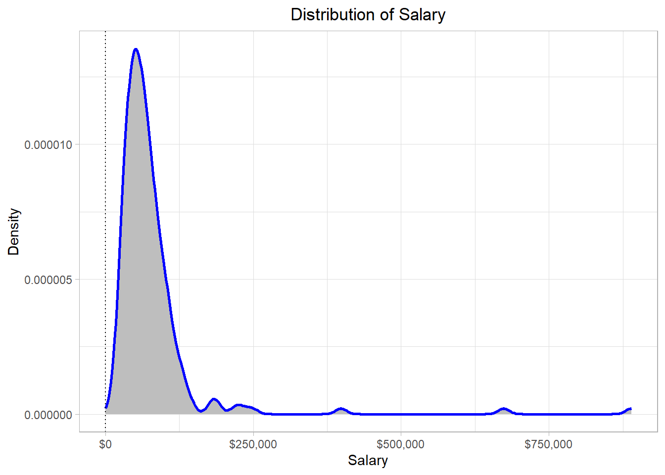
Although it is not always the case, modes typically occur where most of the values are. This makes sense, as it would be highly unlikely for an extreme salary to appear more than once in the dataset. In contrast, more “typical” salary values are much more likely to appear multiple times.
Regarding variability measures, let’s check all relevant measures in a similar way:
# Calculate the range of salaries
range(employee_salaries$Salary)
[1] 13380 889320# Calculate the variance value of salaries
var(employee_salaries$Salary) [1] 6779993919# Calculate the standard deviation of salaries
sd(employee_salaries$Salary)[1] 82340.72The information that comes from the calculation of the range, is that the minimum and maximum values of the distribution are 13,380 and 889,320 respectively. The variance is almost never interpretable so there is no need to try to interpret it. The standard deviation is approximately 82,341, meaning that we would expect a value to deviate from the mean by $82,341. It is important to note though that the standard deviation is affected by outliers, just as the mean does.
In the last line of code, we calculated the standard deviation of
the salaries using the sd() function. If we try to make
this calculation manually though based on the standard deviation
formula that we discussed earlier, we will actually calculate a
different value. This would happen because the
sd() function calculates the
sample standard deviation, not the
population standard deviation; these two types of
deviation are slightly different. The variance and the standard
deviation formulas that we discussed earlier are actually those of
the population.
We have to remember that we are using a sample to make estimates about a population. When we calculate the standard deviation of a sample, our goal is actually to make an estimation about the standard deviation of the population. We want this estimation (the sample standard deviation) to be as close to the actual standard deviation (the population standard deviation) as possible. It turns out that the formulas that we would need to use in this case are slightly different. To calculate the sample variance and the sample standard deviation, we actually use \(N-1\) in the denominator, instead of \(N\):
\[ \hat{\sigma}^2 = \frac{\sum_{x = 1}^{N} (x_i - \bar{x})^2}{N - 1} \]
\[ \hat{\sigma} = \sqrt{\hat{\sigma}^2} = \sqrt\frac{\sum_{x = 1}^{N} (x_i - \bar{x})^2}{N - 1} \]
Notice how we now use different symbols for the mean and the standard deviation. More specifically, we use \(\bar{x}\) instead of \(\mu\) and \(\hat{\sigma}\) instead of \(\sigma\). When we have a sample and we calculate the mean, it turns out that our estimated mean \(\bar{x}\) is expected to be equal to the real mean \(\mu\). Thus, the way that we calculate the mean is the same. Mathematically, we express this idea using the letter \(E\) to reflect our expectation:
\[ E(\bar{x}) = \mu \]
Expectation actually means that if we had to pick up one value for \(\mu\) based on our sample data, our best guess would actually be \(\bar{x}\). However, the formula of \(\sigma\) includes \(\mu\), not \(\bar{x}\). Just as we would expect \(\bar{x}\) to be the closest value that we could calculate for \(\mu\), we would also expect that \(\bar{x}\) would deviate from \(\mu\) by some amount. To account for this expected deviation, we need to use \(N - 1\) instead of \(N\) in the denominator, because we use \(\bar{x}\) instead of \(\mu\) for the calculation. By changing the denominator, we would expect that our estimation (\(\hat{\sigma}\)) is equal to the true \(\sigma\):
\[ E(\hat{\sigma}) = \sigma \]
The next question is of course why decrease the denominator by 1? Why not use \(N - 2\) for example? Although the proof can be shown mathematically, the reason lies in the fact that we have \(N - 1\) degrees of freedom: \[ df = N - 1 \]So, the denominator in the estimation of \(\sigma\) is actually the number of degrees of freedom. A formal definition is that degrees of freedom is the number of values that are free to vary. In the context of estimating the sample variance, this means that only \(𝑁 − 1\) values can vary freely once the sample mean has been calculated. This is because the mean is fixed by the data, so if we know \(𝑁 − 1\) values and the mean, the last value is automatically determined.
The reason therefore that we use the degrees of freedom is that we use the sample mean, not the population mean, to estimate the variability measures for the population. If, somehow, we already knew the population mean and use that in our calculation, then indeed we would not need to decrease the denominator by 1, because the population mean is unique; it is not estimated based on our sample. With a different sample, our estimated values would be different but we would still use the same population mean as this is not affected by our sample. Additionally, if we were interested only in the standard deviation of our sample, we could use \(N\) instead of \(N - 1\) in the denominator.
As a fictional example, suppose that a population has the following values: {1, 2, 3, 4, 5, 6}. Also, suppose that our sample includes all the values except for the last one: {1, 2, 3, 4, 5} The standard deviation of the population data is approximately 1.71. If we use the same formula to calculate the standard deviation in the sample, then we would find a standard deviation of approximately 1.41. However, by using the sample standard deviation formula, we find that the standard deviation is 1.58, which is much closer to the true standard deviation.
An important note is that, in very big samples, decreasing the denominator by 1 does not make much of a difference. This is intuitive as we would expect that a very big sample would capture most of the variation in the population and so we would expect the estimated (sample) standard deviation to be very close to the true (population) standard deviation.
In this chapter, we explored how to visualize and interpret data distributions using tools like histograms and density plots. These visualizations help us understand the overall shape of the data, identify where values tend to cluster, and recognize whether a distribution is skewed, uniform, or bell-shaped. We also made the distinction between discrete and continuous distributions—discrete for countable values like number of employees, and continuous for measurements like salary—each requiring a slightly different approach when interpreting probabilities.
We then looked at how probabilities can be understood as areas under a distribution. With histograms, this is often straightforward since the bars represent actual frequencies. With density plots, the area under the curve still represents probability, but it reflects relative likelihoods, not exact counts. Through a simple example, we saw how to calculate the probability of selecting an employee with a salary above a certain threshold using basic R code.
Finally, we introduced key summary statistics: measures of central tendency, like the mean and median, and measures of variability, like the variance and standard deviation. We emphasized that while these concepts are the same whether dealing with a population or a sample, the formulas do slightly differ—especially for variability—to account for the fact that sample data only give us a partial picture of the full population. Altogether, these tools lay the foundation for more advanced statistical analysis by helping us describe, compare, and reason about data in a structured way.